Case Study/ Seascope
How do you update a 50-year-old niche brand while maintaining its heritage?
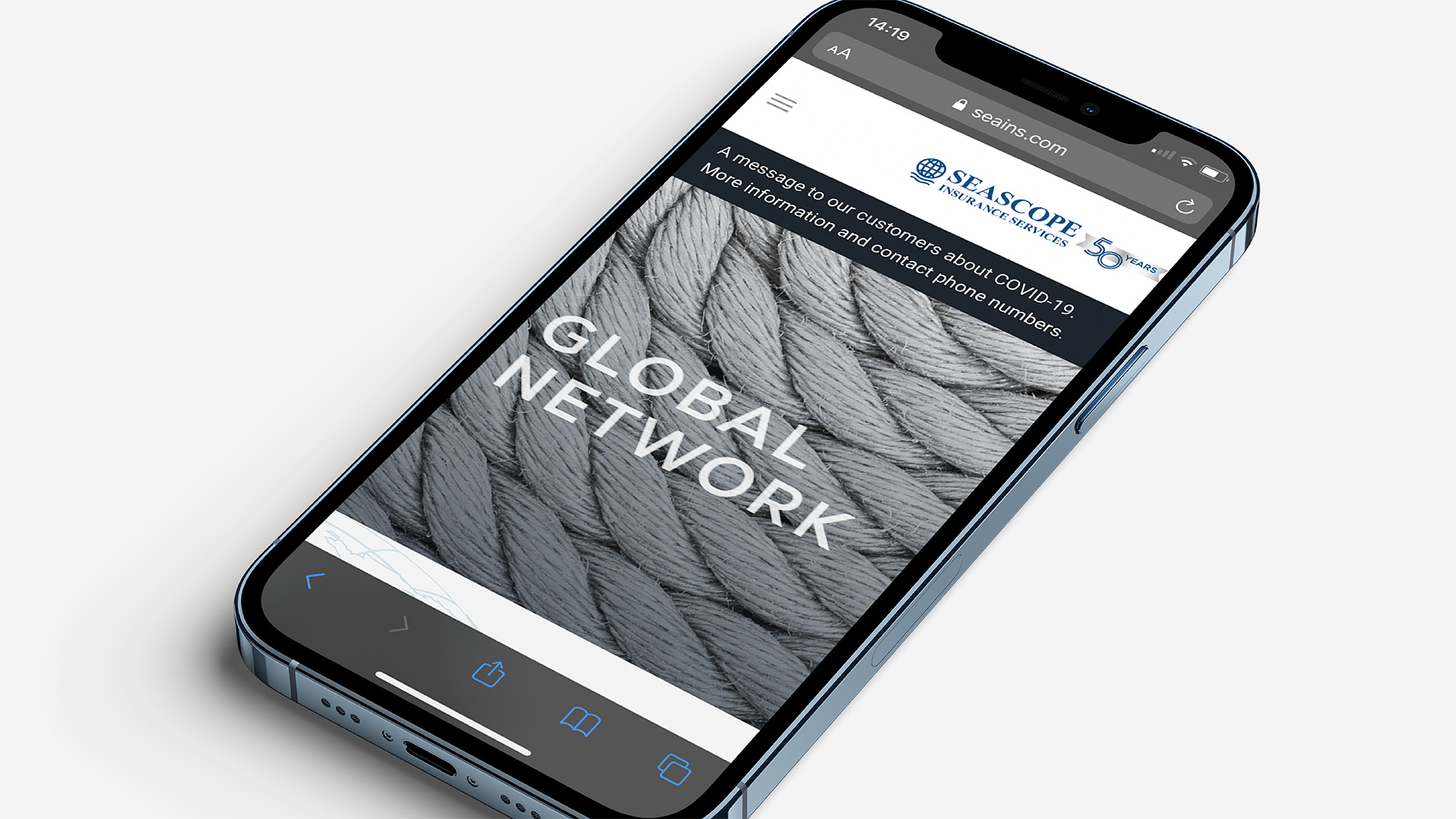
Seascope Insurance Services is a Lloyd’s insurance broker specialising in marine and other high-risk insurance. It was formed at a time when consolidation saw a number of major players in the ship broking, sale and purchase and marine insurance fields offering a one-stop shop for all shipowner needs.
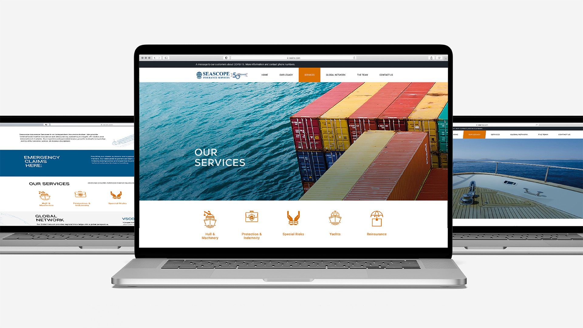
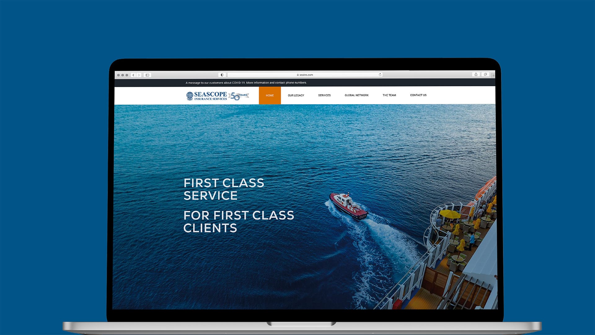
The brand required an uplift and a website upgrade to reflect Seascope’s setup (London, Athens and Hong Kong). It was crucial to balance tradition with a modern look and feel, as well display the niche expertise of gauging specialised risk.

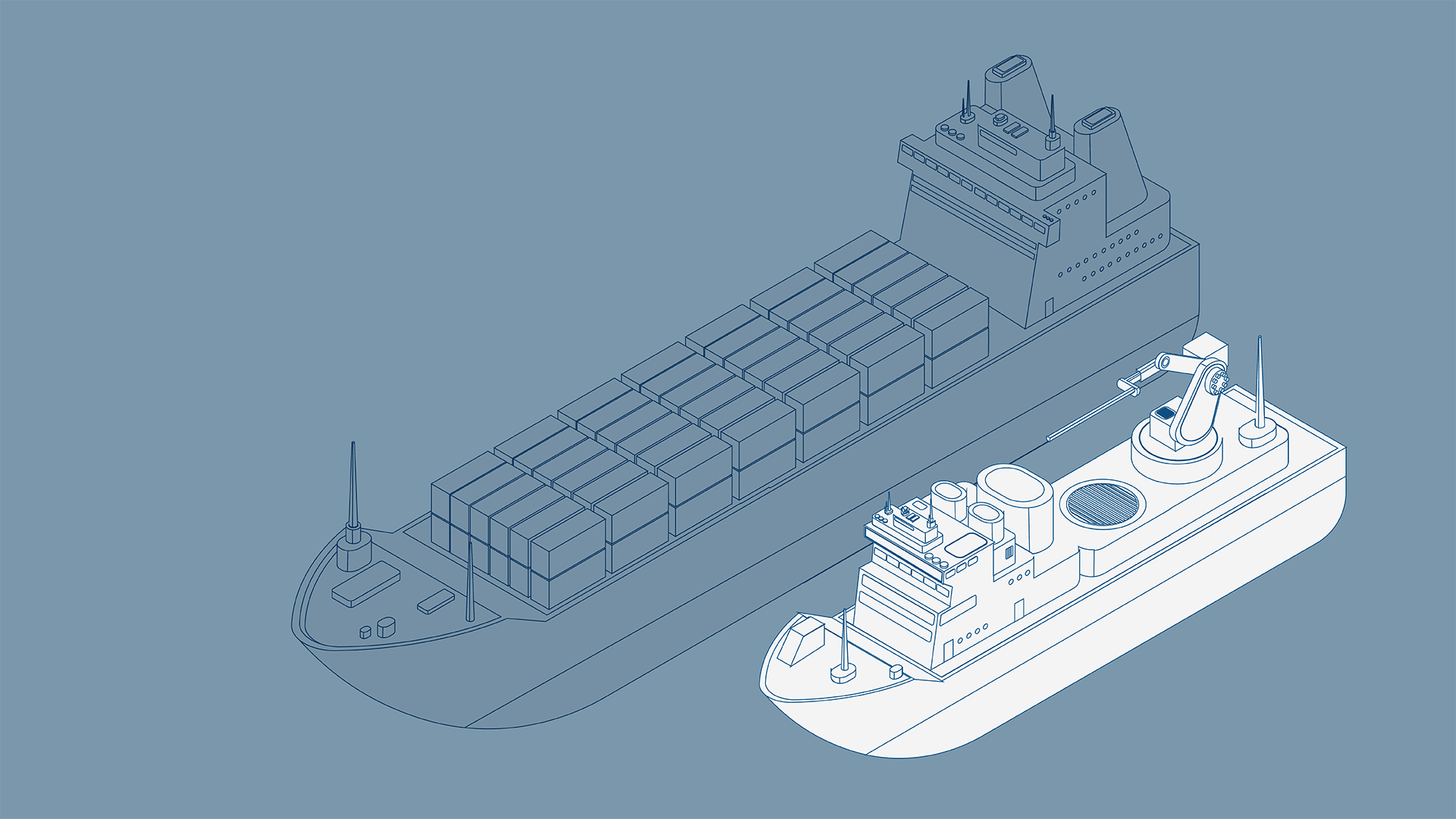
Our creative formula: ‘Near/Far – Maritime close-up/perspective’
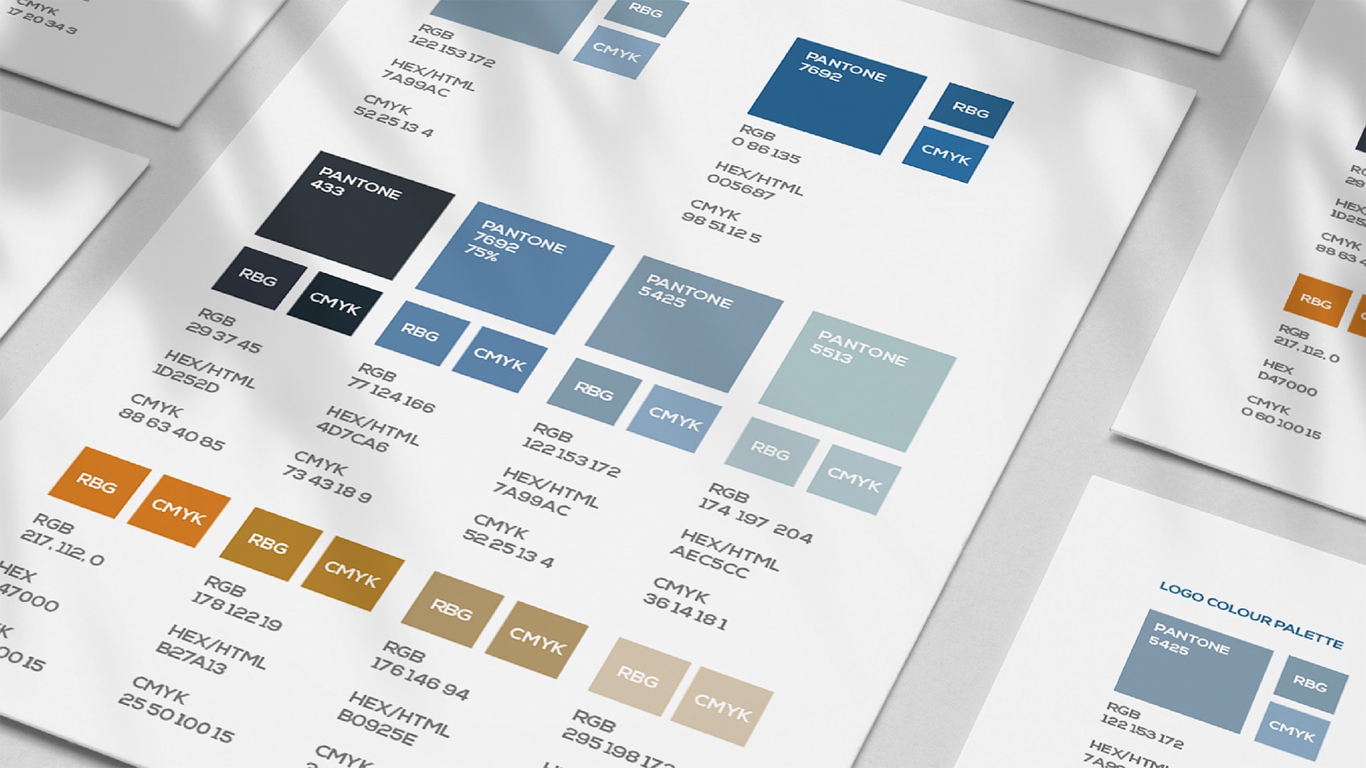
We refined the brand typeface while retaining the serif style, but added a streamlined and softer globe-wave symbol for a new logo combining heritage and dynamism. Building on the corporate deep blue, we used tints as supporting colours to create a ripple of increasing calm through materials. This was balanced with a bold ‘decking’ orange for wayfinding CTAs, menus, buttons and icons.
Additional magic: Taking the theme of ‘near-far’, the imagery reflected the blue-orange colour palette and comprised a series of close-ups of marine components of the shipping journey. In tandem with background vistas this reflected planning and analysis detail, as well as the bigger picture. Bold font use also signalled the confidence with which Seascope go about their business in a high-risk industry.
“NEO got our needs and marketplace right away to provide us with a sharpened brand and smart new website to match our modernised business. Great to work with, they coolly steered us through the creative and technical process, which was no mean feat given that the project was delivered during the pandemic.”
More Magic
Top Tags

//
Creativity is a catalyst for connecting
people and ideas.