Case Study/ Zero Risk

How do you convey a complex multi-layered narrative in a strong simple design?
NEO Head Creative Mark Terry was recently commissioned to design the cover of Simon Hayes’ debut novel Zero Ri$k. While a seeming departure from the usual B2B project brief, it was Mark’s experience of the business sector that the novel inhabits that made him the ideal choice for the assignment. Simon’s background in financial services (securities analyst), executive search and consultancy, which he draws on in his novel, meant he was looking for a creative collaborator who understood his professional world.
A sophisticated narrative – described as ‘a multi-layered, race against time, cyber-crime thriller with a simple, original, ‘Black Swan’ premise that will keep you awake at night and questioning your dependence on modern technology’ by the novel’s publisher Rubriqs Press – the novel is rich in visual themes and pathways.
But whichever pathway was chosen, it needed to satisfy the competing demands of the publisher and PR team, who wanted a cover design along the lines of the existing bestsellers in the category (think John Grisham or Dan Brown), and the author, who desired a more striking motif for the front of his book that reflected the complexity of its narrative.
The design also needed to consider initial reader research that indicated the book was particularly popular among women, meaning that the design needed to appeal to this demographic.

Our creative formula: ‘Frame it in the concept, code the sins’
Mark and Simon began by looking at the existing bestsellers’ cover designs for inspiration and agreed that they liked the striking simplicity of both Yellowface by RF Kuang and Anna O by Matthew Blake. This raised a dilemma. How do you keep things simple and visually convey a range of tropes including cyber-crime, coding, the seven deadly sins, clues, a snowstorm at Christmas, the city of London and the hacker’s nome de plume – Hieronymus Bosch?
There was another ‘element in the room’, though, which was the fact that the novel centred around a so-called ‘black swan event’*. But rather than being a complication, this provided the solution.
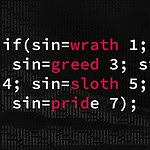
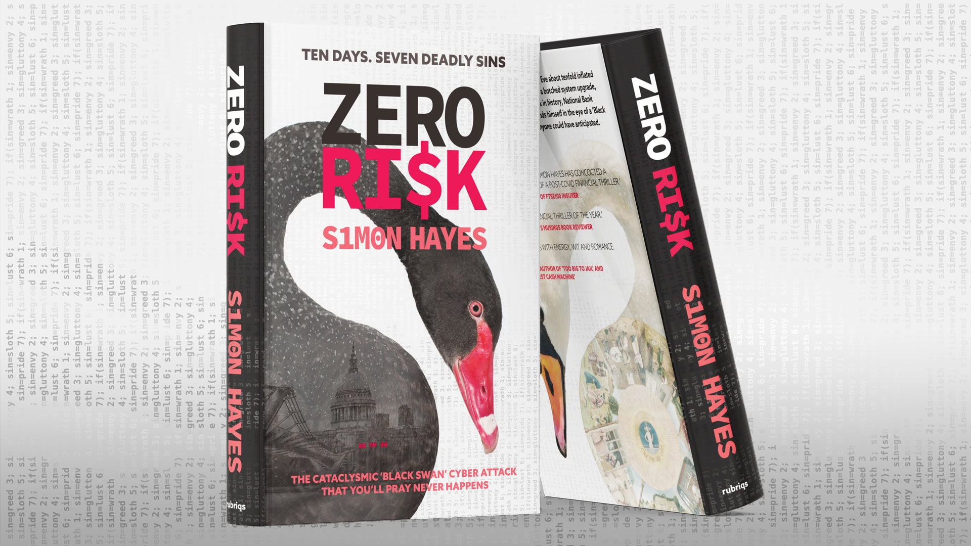
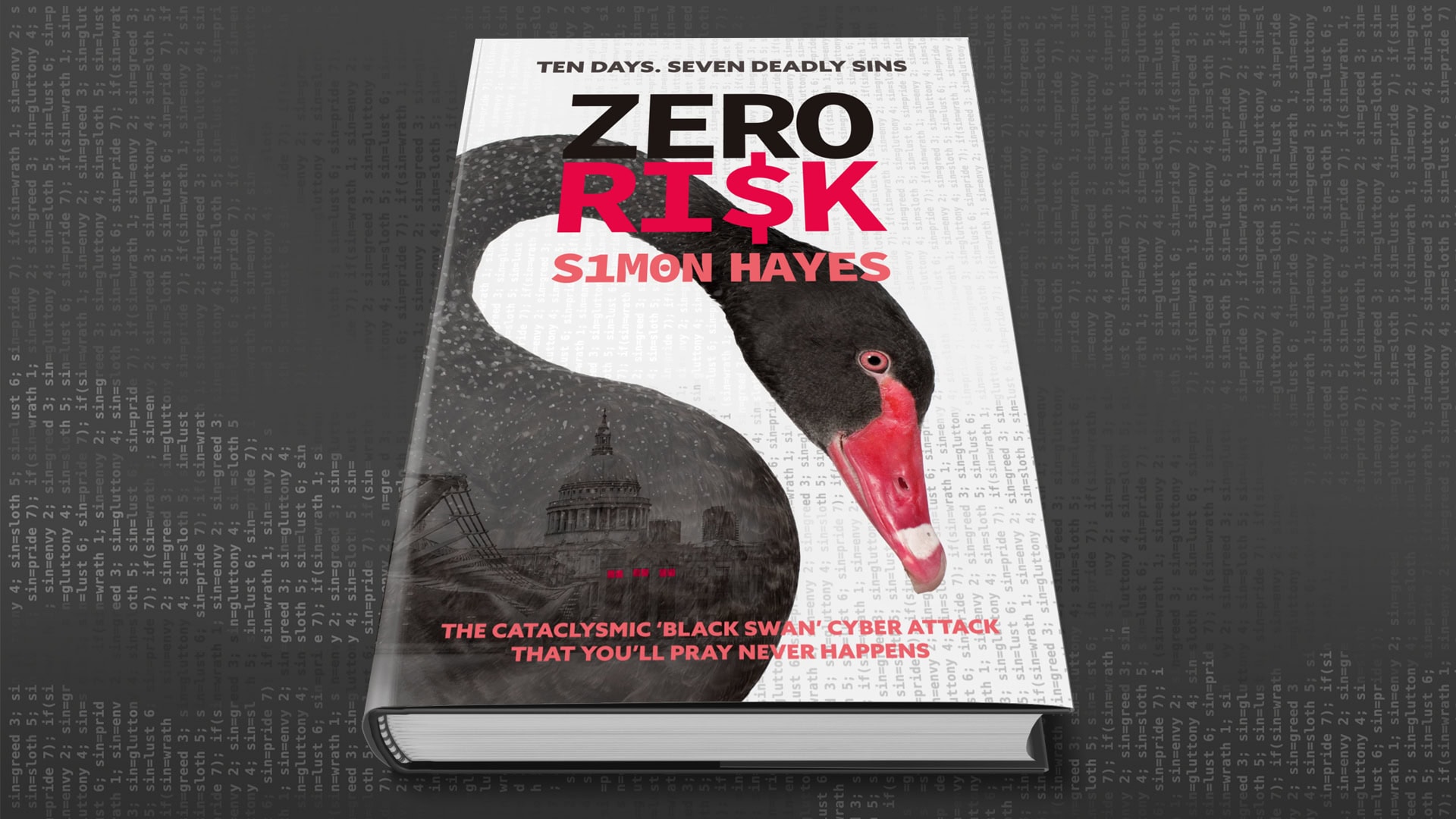
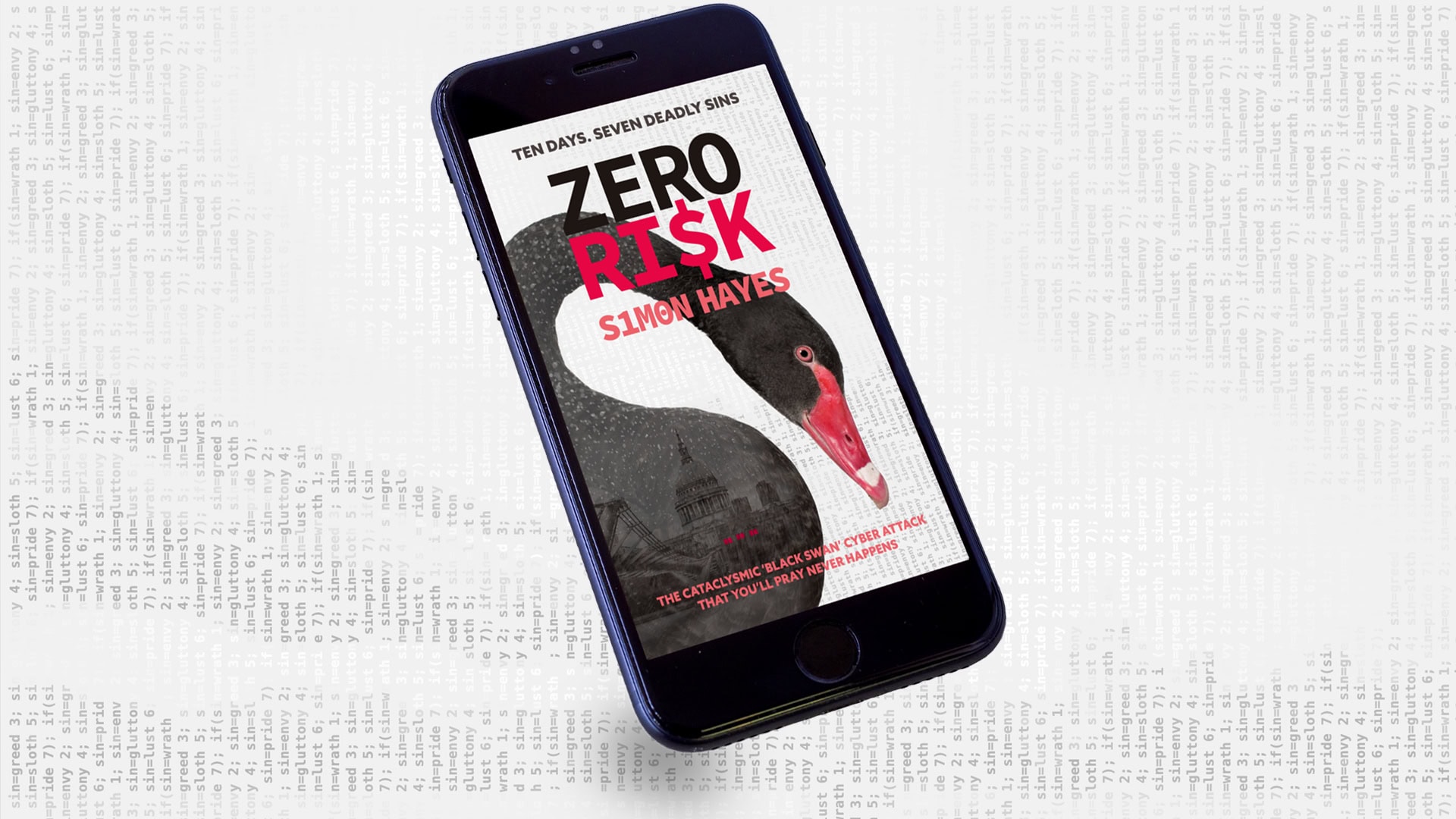
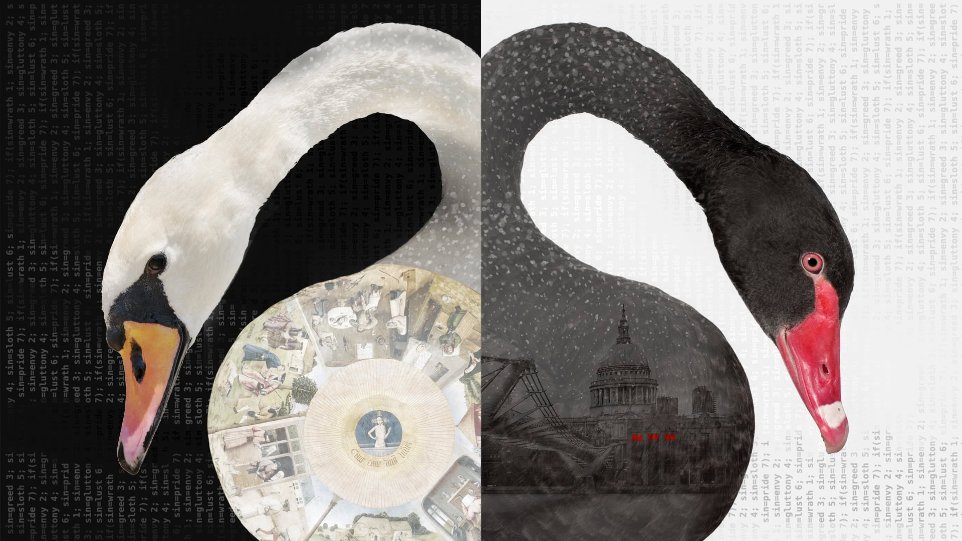
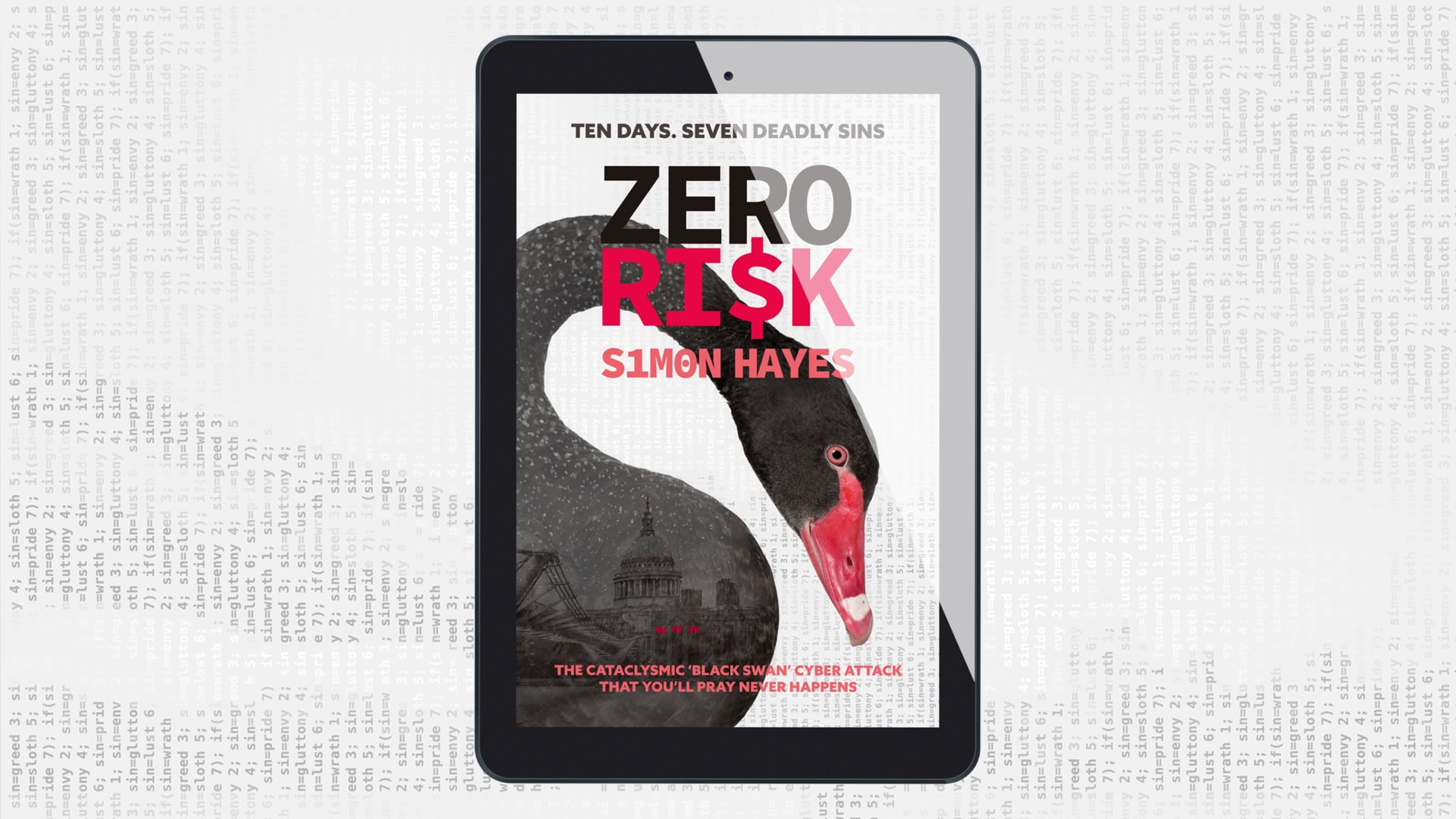
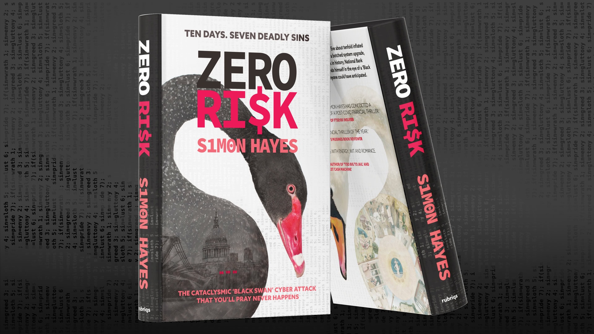
Using the swan as a framing device became the answer. In the finished article, the London cityscape in a blizzard is captured within the body of the swan to resemble a snow globe. The seven deadly sins, set in code, rain down in vertical lines in the background. These devices come together in a single striking visual language that conveys the sophisticated nature of the novel’s plotting, providing just enough clues to intrigue the potential reader.
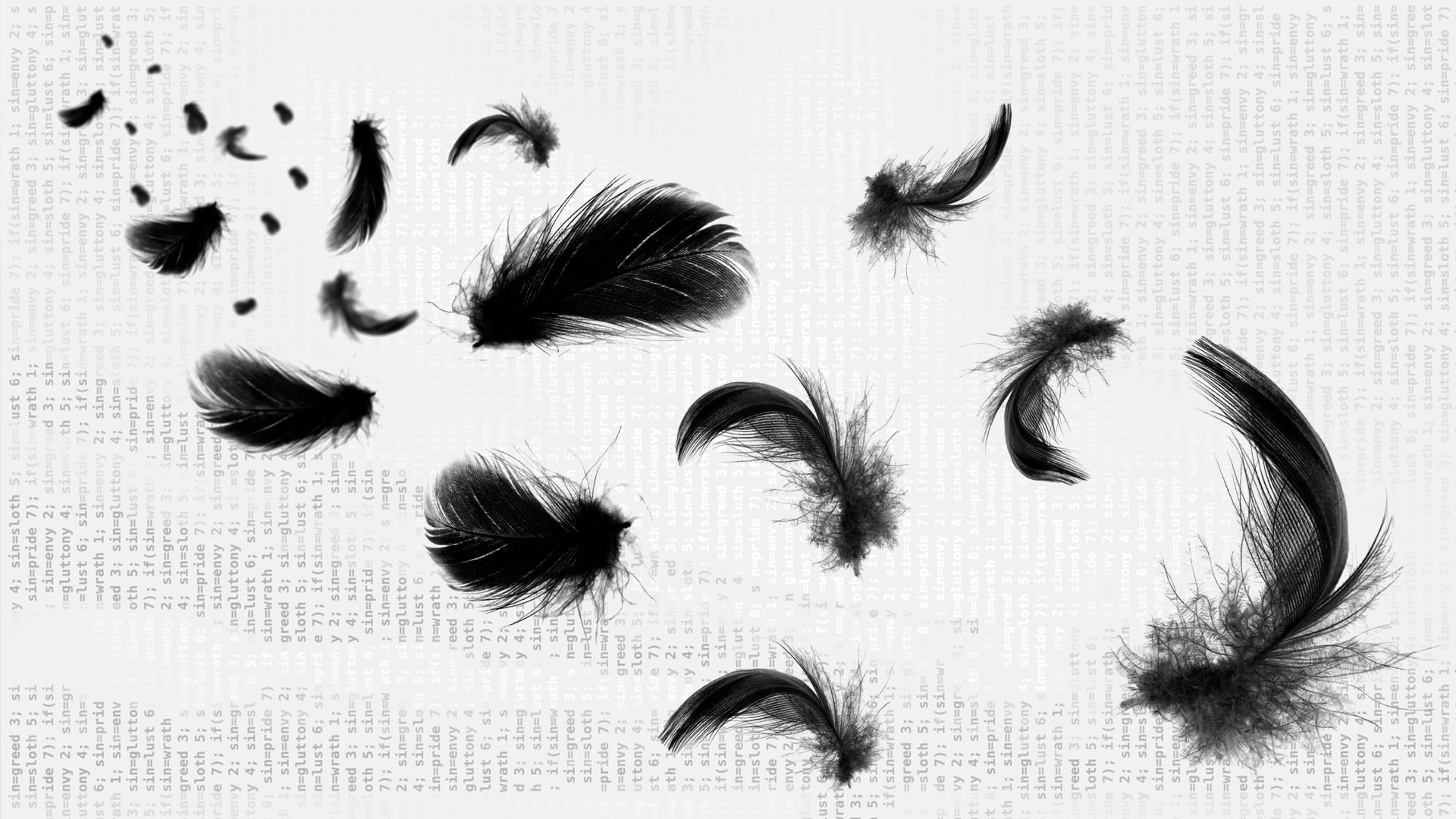
Additional magic: More plumes please! Feathers appear as a visual metaphor for the clues (breadcrumbs) across other marketing materials. A white swan containing the circular central panel of Bosch’s The Seven Deadly Sins appears on the book’s back cover to provide an additional clue concerning the key to cracking the novel’s code.
“It was such a pleasure working with Mark at NEO on the cover and wider design motifs. Zero Ri$k is a multi-layered novel: it’s a financial and political thriller about a cataclysmic ‘Black Swan’ cyber attack, but it’s also a modern morality tale, in which the art of Hieronymus Bosch is crucially important. It’s a story of love, loss and redemption and it’s centred on London. Somehow, Mark managed to come up with ideas that captured them all! Just outstanding work. And a genuinely enjoyable working partnership.”
*A black swan event (or black swan theory) is a metaphor that describes an event that comes as a surprise, has a major effect or potentially severe consequences, and is often inappropriately rationalised after the fact with the benefit of hindsight. Black swan events are characterized by their extreme rarity and severe impact, and the widespread insistence they were obvious in hindsight. The term is based on a Latin expression which presumed that black swans did not exist. (Wikipedia/Investopedia.com)
More Magic
Top Tags


//
Creativity is a catalyst for connecting
people and ideas.